
Using Pie Chart Visualizations in HighLevel Funnel and Site Analytics
Learn how to leverage visual pie chart reports in HighLevel to analyze traffic, compare funnel conversions, and identify drop-off points without spreadsheet clutter.
Nexus Hub editorial · 5 min read
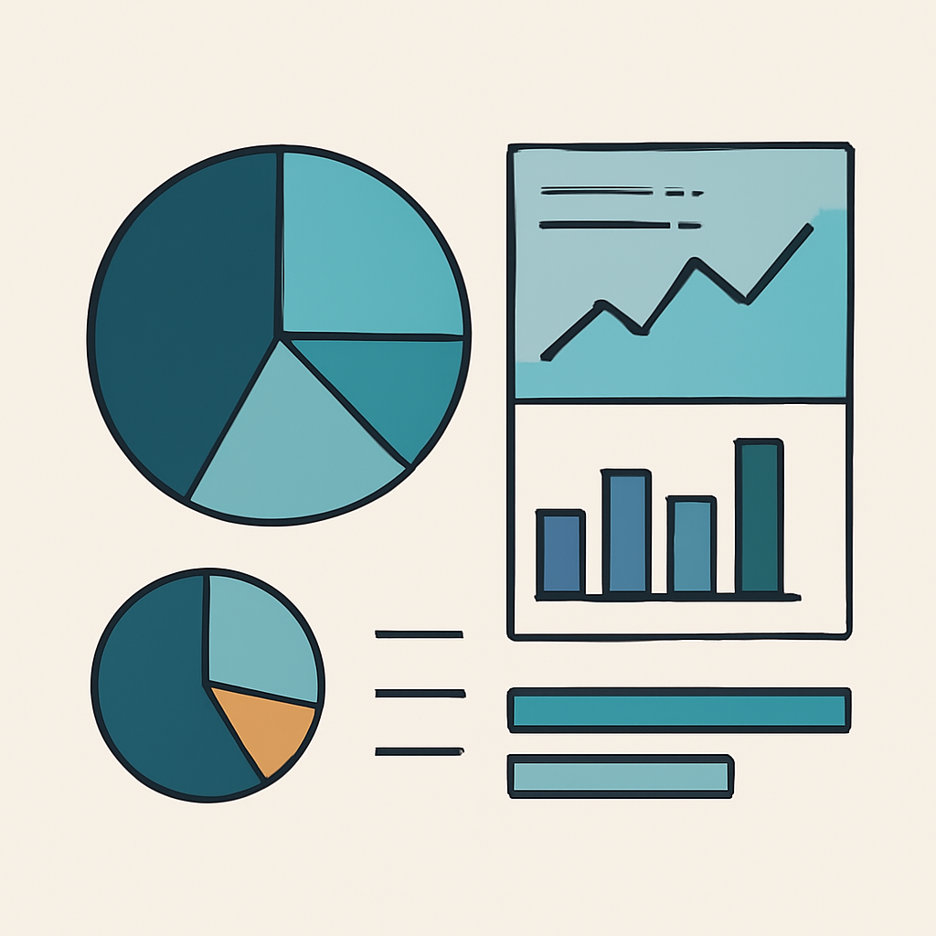
When managing multiple client funnels simultaneously, diagnosing traffic patterns and conversion drop-offs using raw data logs or dense spreadsheets can slow down operations. Standard linear charts track general trends over time, but they rarely give a clear picture of proportional distribution across different funnel steps or standalone web pages.
HighLevel addresses this reporting friction by incorporating dedicated pie chart visualizations within the site analytics interface. These visual modules allow operators to quickly evaluate traffic flow, revenue allocation, and visitor engagement across funnels and websites at a glance.
Navigating to the Analytics Visualizations
Accessing the visual analytics tools requires navigating into the specific sub-account where the funnels or websites reside. The reporting engine automatically aggregates data from both traffic events and processed transactions.
- Open the target sub-account and select the Sites menu from the primary navigation sidebar.
- Select the Analytics tab from the horizontal sub-menu at the top of the interface.
- Scroll below the initial time-series line graphs to find the dedicated pie chart widgets.
- Locate the two distinct visualization cards: Page-View distribution and Sales distribution.
Filtering Data for Targeted Analysis
Aggregated data across all assets can obscure individual campaign performance. To gain meaningful insights, operators must narrow the dataset using the configuration controls positioned directly above the charts.
Filtering allows you to isolate macro trends, such as overall site traffic, or micro details, such as conversion rates on a specific opt-in step within a complex sales pipeline.
- Asset Type Filter: Toggle between Funnel and Website views depending on the structure of the campaign you are analyzing.
- Date Range Selector: Specify precise date boundaries to evaluate the impact of recently launched ad campaigns or structural design updates.
- Individual Asset Dropdown: Isolate a specific funnel or website to display a step-by-step proportional breakdown of page visits and sales.
Interpreting Proportional Metrics for Optimization
While line graphs demonstrate chronological movement, pie charts emphasize proportional volume. In a multi-step marketing funnel, understanding what fraction of total visits hits each step immediately reveals traffic bottlenecks.
For example, if an initial landing page represents 80% of total page views while the order form accounts for only 4%, the primary friction point is clearly situated on the landing page copy or offer presentation. Conversely, if traffic is distributed evenly but sales revenue is heavily skewed toward a single upsell step, that specific offer is driving the campaign's overall profitability.
Always establish a baseline measurement in the analytics dashboard before making design or copy revisions. Revisit the pie chart distribution after running tests to verify whether visitor progression improved.
Streamlining Performance Reporting for Clients
Communicating campaign results to stakeholders requires direct and unambiguous visual presentation. Raw data exports and multi-tab spreadsheets often lead to unnecessary confusion during strategic reviews.
Incorporating clear visual distributions into routine performance reviews allows account managers to clearly demonstrate campaign progress. By demonstrating exactly where visitor traffic flows and where revenue concentrates, agencies can easily justify operational adjustments, budget changes, or CRO testing initiatives.
Need help applying this to your account?
Ask inside Nexus Hub — Charles is live Mon, Wed and Fri.
Measuring Email Link Performance: A Practical Guide for HighLevel Agencies
Structuring HighLevel Sales Pipelines for Clear Revenue Tracking
Building and Deploying Lead Generation Funnels in HighLevel Fast
Nexus Hub is an independent community and educational resource. It is not affiliated with, endorsed by, or sponsored by HighLevel.