
Streamlining Asset Styling with Centralized Color Management in the Builder
Centralized color management in builder tools eliminates manual hex code copying, enforces visual consistency across client assets, and accelerates production for agency teams.
Nexus Hub editorial · 5 min read
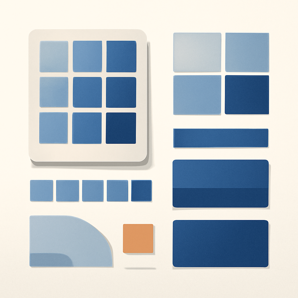
Manual hex code entry remains an understated point of friction in agency production workflows. When account managers, designers, or technical specialists constantly switch tabs to copy color strings from brand guidelines into individual form or survey elements, build times slow down. Worse, minor typos lead to inconsistent shades across client-facing assets, undermining visual quality control.
Modern builder color interfaces address this operational drag by integrating native palette management directly into the styling drawer. By providing structured access to established brand boards and account-wide custom colors, teams can eliminate repetitive code entry and ensure every published page or form adheres strictly to visual standards.
Understanding the Color Picker Structure
The updated builder interface organizes color choices into distinct, structured sections rather than displaying an unstructured list of recent or random hex values. This layout gives builders immediate visual clarity regarding the source and intended use of every color selected.
- Brand Colors: Pulls directly from the established primary brand board, giving instant access to approved identity colors.
- Global Custom Colors: Stores reusable custom shades created during builds that are needed across multiple assets outside the main brand board.
- Default Colors: Provides standard, neutral system shades for fast, basic styling adjustments.
By categorizing these palettes visually, team members can instantly determine whether they are selecting an officially approved brand shade or an auxiliary palette color. Interactive preview feedback further confirms choices in real time before changes are committed.
Managing Global Custom Colors Across Projects
While main brand palettes cover core identity elements like primary buttons and main typography, individual campaigns often require secondary highlight shades, specific hover state tints, or contextual alert colors. Saving these as global custom colors ensures they remain accessible across every form, survey, and builder page in the account.
To configure a reusable global custom color within the builder drawer:
- Open the styling settings panel for any visual element inside the form or survey builder.
- Access the color selection interface and select the Manage control.
- Click Add New within the Global Custom Colors configuration modal.
- Define the exact color value using the picker or manual code entry.
- Save the entry and close the configuration window.
- Select the newly created shade to apply it immediately to the active element.
Once saved, global custom colors persist across projects within the workspace, eliminating the need to record or reference secondary color codes in external documentation.
When to Use Brand Boards versus Global Custom Colors
Maintaining an efficient design system requires clear rules around when to update a primary brand board versus saving a global custom color. Clear guidelines prevent color swatches from becoming cluttered over time.
- Use Brand Colors for core visual identity elements, including primary logos, main call-to-action buttons, header backgrounds, and official typography shades.
- Use Global Custom Colors for project-specific utility shades, secondary hover states, campaign badge highlights, or sub-brand variations that are reused across assets but do not belong in the master brand palette.
Keeping these streams separate ensures that master brand boards remain clean and uncluttered, while operational teams maintain the flexibility to establish standardized auxiliary colors for specific funnel builds or survey series.
Operational Benefits for Agency Production
Standardizing color management directly within the design workflow delivers tangible operational advantages beyond simple cosmetic neatness. For agencies managing high asset volume across multiple team members, centralized color swatches significantly reduce friction.
- Eliminating tab switching: Builders no longer need to keep external brand guidelines, design tools, or spreadsheets open just to reference standard hex values.
- Preventing visual drift: Team members cannot accidentally select off-brand hex variations or near-match colors when building new assets.
- Accelerating quality assurance: QA reviewers spend less time verifying color accuracy across client assets because elements are selected from pre-validated swatches.
- Simplifying team onboarding: Junior builders or freelance specialists can instantly execute brand-compliant designs without studying extensive external style guides.
Small improvements in builder efficiency compound rapidly across dozens of client accounts. By converting color selection from a manual copying task into a structured single-click workflow, agencies preserve visual integrity while accelerating project delivery.
Need help applying this to your account?
Ask inside Nexus Hub — Charles is live Mon, Wed and Fri.
Optimizing CRM Pipeline Management with Dropdown Access and Custom Stage Colors
Automating CRM Custom Field Updates From Membership Intake Forms
Managing Native Image Alt Text in HighLevel Social Planner Workflows
Nexus Hub is an independent community and educational resource. It is not affiliated with, endorsed by, or sponsored by HighLevel.