
Ecom Product Details Page Customization (Desktop Media Size & Layout)
Optimize your store's conversion rate with HighLevel’s desktop customization for product detail pages. Learn how to adjust media sizes, choose left or right layout positioning, and use directional alignment to create a better visual hierarchy and shopping experience for your customers.

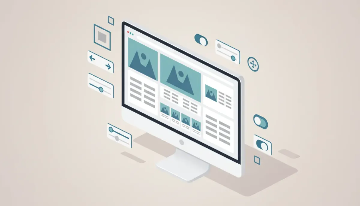
Product pages are where browsers turn into buyers. The way product images and details are arranged on desktop can directly influence clarity, trust, and conversions. HighLevel’s latest desktop customization options for the product detail page give store owners easy, visual control over that arrangement—letting you choose directional layout alignment, position product media left or right of details, and pick image sizes from small to large. These are small controls with big impact.
The Complete Operating System for Growth
Join over 60,000+ agencies and businesses using HighLevel to capture more leads and close more deals. Start your trial today and get instant access to the Nexus Hub resources.
Claim Your Free Trial & BonusesWhy layout and media size matter
People shop visually. A clean, logical product page layout helps customers understand the product quickly and decide to purchase. Default, center-aligned product templates can work, but they do not always match your brand, product type, or conversion goals.
Giving store owners control over the layout creates three important benefits:
- Improved hierarchy and focus — Directional alignment helps guide the eye from media to product details or vice versa, depending on what you want to emphasize.
- Better storytelling — Positioning images on the left or right lets you create a narrative flow that matches photography or copy strategy.
- Faster decision-making — Adjustable image sizes let you prioritize imagery for tactile products or reduce image dominance for text-forward products.
What changed: the new desktop customization options
Here’s a quick breakdown of the new controls now available for desktop product detail pages:
- Directional layout alignment — Layout aligns along a chosen direction instead of a fixed center-based justification. This creates cleaner separation and a stronger visual structure for content blocks.
- Custom product layout positioning — Choose whether the product media section appears on the left or the right relative to the product information block. This provides flexible design options without custom CSS.
- Adjustable product image sizes — Select small, medium, or large media sizes so the image weight matches your product strategy and page goals.
How to choose the right layout and media size
Choosing the ideal layout should be guided by product type, photographic style, and buyer behavior. Use these practical rules of thumb to decide:
- Big, tactile products — For furniture, apparel, or any product where visual detail matters, use large images. Position media on the left when you read left to right so imagery can anchor the page and lead into product information.
- Text-first or technical products — For software, consumables, or highly technical items, consider medium or small images to keep attention on specs and features. Position media on the right if your copy needs to lead the user and imagery is secondary.
- High-quality lifestyle photography — If photography tells a story, choose larger media and a side alignment that complements the narrative. Use directional alignment to create visual rhythm on category and collection pages.
- Multiple images or image gallery — If a product has multiple photos or an interactive gallery, medium size often balances variety with visual clarity. Ensure gallery controls and thumbnails are obvious and not crowded by oversized media.
Design and UX best practices
Changing layout and image size is a design lever—use it intentionally. Keep these principles in mind:
- Maintain visual hierarchy — Make sure the product title, price, and primary call to action remain visible and prominent regardless of the media size you select.
- Align with the browsing experience — For audiences that scan quickly, left-aligned media with immediate product details to the right can improve comprehension and increase clicks on add-to-cart.
- Whitespace matters — Larger images should be paired with adequate padding. Crowded layouts reduce perceived quality.
- Keep key information above the fold — Especially on desktop, the first impression counts. If image size pushes essential actions below the fold, consider reducing the image size or moving media to the side.
- Consistent styling across products — Within a collection, keep media position and size consistent to avoid jarring layout changes when customers browse multiple items.
Practical steps to implement layout changes in HighLevel
HighLevel’s Ecom features make it straightforward to update product page layout without custom code. Follow these steps as a general guide to apply new desktop settings:
- Open your HighLevel account and go to the Ecom product settings for the store you want to update.
- Locate the product detail page customization or layout settings area.
- Choose directional alignment to determine how the layout is justified across the container.
- Select whether product media should be positioned on the left or the right of the product details.
- Pick an image size: small, medium, or large. Preview the change at desktop size to ensure layout balance.
- Save changes and test multiple product pages to confirm visual consistency and functionality, including gallery behavior, zoom, and add-to-cart elements.
These steps are intentionally high level because specific navigation labels can vary with updates. If you use a HighLevel agency setup, apply the changes at the template level first so multiple product pages inherit the new layout automatically.
Testing and optimization: measure what matters
Layout changes are design experiments. Use data to validate decisions. Here are recommended metrics and testing strategies:
- Primary metrics to track
- Product page conversion rate
- Click-through rate to add-to-cart
- Average time on product page
- Bounce rate for product pages
- A/B testing ideas
- Left vs right media position for a specific product category
- Large vs medium image size on high-ticket items
- Directional alignment changes paired with different hero images
- Qualitative feedback — Use heatmaps and session recordings to see how users interact with images and product details. Combine this with customer feedback or support queries related to product imagery.
Tips for HighLevel agencies and teams
If you run an agency or manage multiple stores, these tips help scale the layout updates efficiently and keep quality consistent across client accounts:
- Standardize templates — Create a few trusted templates (e.g., visually driven, copy-driven, gallery-focused) and apply them based on product category or client brand guidelines.
- Document layout rules — For each template document the recommended image sizes, ideal photography style, and alignment choice so designers and copywriters are aligned.
- Leverage workflows and automations — In HighLevel, connect ecom actions to workflows so certain product states trigger marketing automations. For example, when a product page gets updated with a new hero image, trigger a review checklist or visual QA automation.
- Use A/B testing within client roadmaps — Include layout experiments as part of ongoing CRO (conversion rate optimization) plans and report the lift or learnings monthly.
- Educate clients — Explain why image size and alignment matter for conversion and resale value. Simple visuals demonstrating left vs right positioning help non-technical stakeholders make decisions faster.
When to avoid big media
Large product images are not always the right choice. Consider smaller sizes in these scenarios:
- Products where text or technical specifications carry the decision weight
- Catalog pages where many product variations must fit within a single screen
- When page speed is impacted and image optimization cannot compensate
- When multiple competing visual elements (badges, videos, interactive sections) lead to visual clutter
Image optimization checklist
Large images can slow down pages if not optimized. Use this checklist to preserve visual fidelity and performance:
- Compress images without noticeable quality loss
- Use responsive image formats where available (WebP or optimized JPEGs)
- Serve scaled images for desktop and smaller sizes for tablet and mobile
- Use lazy loading for off-screen gallery images
- Check page speed after layout changes and adjust image sizes if necessary
Examples and layout strategies by product type
Here are a few practical examples of layout choices that work well for common product categories:
- Apparel — Large media with lifestyle shots on the left, product details and size selector on the right. Use directional alignment that nudges the eye toward product options and CTAs.
- Electronics — Medium images with technical specs highlighted in a right-side column. This minimizes distractions and lets shoppers compare specs quickly.
- Home goods — Large hero image plus small gallery thumbnails. Keep media left if the photo contextualizes the item in a room.
- Supplements and consumables — Small to medium images with emphasis on certs, ingredients, and social proof to the right.
Implementation pitfalls and troubleshooting
Be aware of common issues that can arise when changing layout and media size:
The Complete Operating System for Growth
Join over 60,000+ agencies and businesses using HighLevel to capture more leads and close more deals. Start your trial today and get instant access to the Nexus Hub resources.
Claim Your Free Trial & Bonuses- Overlapping elements — If your theme or custom code has hard-coded widths, changing media size might cause overlap. Check responsive breakpoints after changes.
- Gallery behavior — Verify that zoom, lightbox, and carousel behaviors function correctly after layout adjustments.
- Third-party integrations — Ensure any third-party widgets or upsell scripts adapt to the new layout without breaking the page flow.
- Inconsistent templates — If some product pages were manually customized, they might not inherit the template-level update. Audit pages for consistency.
How HighLevel helps you scale better
HighLevel’s platform is built for agencies and businesses that want to move fast without breaking things. The new product detail page customizations fit into broader HighLevel strengths:
- Template control — Apply layout settings across multiple products and stores from a single place.
- Workflows and automations — Connect product updates to automated QA or marketing sequences, ensuring changes trigger the right downstream actions.
- Agency-friendly management — Roll out tested templates to client accounts, maintain brand consistency, and track performance across stores.
If you manage product pages as part of an agency stack or run a multi-store operation, using HighLevel templates and linked workflows reduces manual work and ensures consistent shopper experiences.
Resource and next steps
To put these layout changes into practice:
- Create a few template variations and pilot them on best-selling products.
- Run A/B tests with clear primary metrics defined.
- Optimize images and monitor page speed.
- Use HighLevel workflows to automate QA steps after template changes.
For agencies and teams looking for ready-made templates, best-practice layouts, and implementation support, Nexus Hub is a community resource that offers templates, checklists, and implementation guides built for HighLevel users. If you are not yet testing HighLevel for ecommerce and agency operations, consider starting a free trial to explore how these layout controls can be applied across your stores.
Checklist: Launching a new product page layout
- Define the goal: increase conversions, improve clarity, or highlight imagery
- Choose template: visual-first, copy-first, or gallery-focused
- Select media position: left or right
- Pick image size: small, medium, large
- Optimize images for web and responsive breakpoints
- Test across a sample of products and devices
- Run an A/B test and collect quantitative and qualitative data
- Document the changes and roll out via templates if successful
Final thoughts
Small design controls—where the image sits and how big it appears—can dramatically change how shoppers perceive products and make buying decisions. Directional alignment, media position, and adjustable image sizes give store owners the flexibility to craft product pages that match their brand and conversion goals.
Use HighLevel’s template and workflow capabilities to scale these changes across stores and clients, pair them with image optimization and testing, and make data-driven decisions rather than design guesses. With intentional layout choices, product pages become cleaner, more focused, and more effective at converting visitors into customers.
FAQ
Can I change layout settings for desktop only?
Yes. The customizations described are targeted at desktop media size and layout. It is important to test across breakpoints since mobile and tablet experiences may still require different settings. Use responsive previews and check behavior on smaller screens after applying desktop-specific changes.
Will changing media position affect page speed?
Changing position itself does not directly impact page speed, but larger images can. Optimize images (compression, responsive formats, lazy loading) to preserve performance when using larger media sizes.
Should I use large images for every product?
Not necessarily. Use large images for tactile, high-visual products. For products where specs or copy drive buying decisions, medium or small sizes may perform better. Run tests to confirm what works for your catalog.
How do I keep layout consistent across many product pages?
Create and apply templates at the store or account level, and ensure manual customizations are minimized. For agencies, maintain a template library and rollout plan that standardizes layout choices across clients.
Can HighLevel workflows be used with product layout changes?
Yes. Use workflows to automate QA, notify teams when layouts change, or trigger marketing sequences after visual updates. Workflows help ensure layout updates are coordinated with broader marketing and operational processes.
Where can I find recommended templates or support?
Nexus Hub offers templates, resources, and implementation support crafted for HighLevel users and agencies. It’s a practical place to find starting templates and best practices for product page layouts and more.
The Complete Operating System for Growth
Join over 60,000+ agencies and businesses using HighLevel to capture more leads and close more deals. Start your trial today and get instant access to the Nexus Hub resources.
Claim Your Free Trial & Bonuses