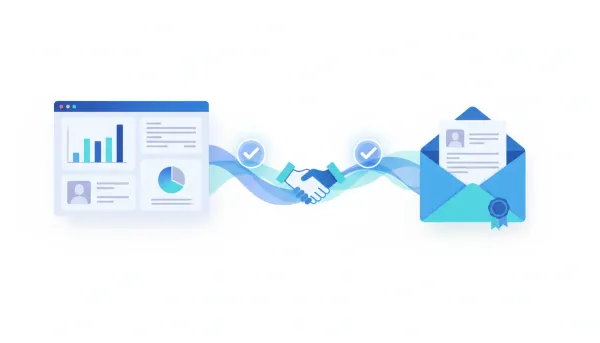
Funnel and Website AI Upgrades: Faster, Cleaner Pages That Actually Save Time


As a small business, we constantly juggle priorities: getting our message right, launching pages quickly, and keeping designs consistent across devices. Recent upgrades to the AI page creation tools we use have made that juggling act noticeably easier. These changes are not flashy for the sake of it. They focus on two practical improvements we care about most: better initial results and smarter, precise edits that reduce rework.
Overview: What the upgrades deliver
The updates improved two core things we rely on for landing pages and website pages:
- Better initial designs – more professional templates, stronger imagery, and layouts that hold up across phones, tablets, and desktop.
- Section-level revision control – the ability to ask for precise edits to specific sections without regenerating the whole page or losing the design.
Those sound small, but they compound into less time spent tweaking, fewer styling inconsistencies, and faster launches. For a growing business, that equals fewer missed opportunities and lower stress.
Key improvements in detail
More polished, premium designs out of the box
The AI now produces layouts that look intentionally styled rather than generically assembled. That shows up in:
- Cleaner typography and spacing that reads well on mobile and desktop.
- Better image selection and placement so visuals support the message rather than distract from it.
- Consistent colors and element alignment across sections, which reduces the manual touch-ups we used to do after generation.
Stronger, more reliable layouts across devices
Mobile-first users are a majority for many of our funnels. The upgrade focuses on reliability across breakpoints, which means:
- Fewer layout bugs when switching from desktop to mobile previews.
- Sections that maintain hierarchy and readability without manual stacking or margin fixes.
- Less time spent sending screenshots to teammates asking them to check responsive issues.
Precise, section-level edits instead of full-regenerate
The most practical improvement for our day-to-day is being able to make targeted edits. Rather than regenerating a whole page when we want to change a headline or swap a hero image, we can:
- Ask the AI to update a specific section and keep the rest of the design intact.
- Switch an entire section style, for example changing a light header to a dark header, without losing button styles or spacing elsewhere.
- Maintain a consistent tone and layout across multiple pages by revising only the areas that need it.
Why this matters for our business
We measure tools by the time they free up and the mistakes they prevent. These upgrades help in three direct ways.
1. Faster page launches
Instead of spending hours adjusting spacing, re-uploading images, or correcting mobile layouts, we can get an initial page that’s already close to publish-ready. That speed matters when we’re promoting limited-time offers or testing new funnels.
2. Cleaner collaboration
Team members and contractors appreciate not having to guess which element changed after a full regenerate. With section-level revisions, handoffs are more predictable. Designers can lock down sections we want to keep, and marketers can iterate on copy or CTAs without fear of breaking the layout.
3. Less tool fatigue
We’ve been able to consolidate steps that used to require external editors. Better image choices, improved layouts, and smarter edits mean fewer tools in the workflow and fewer file exports. That saves time and reduces the cognitive load of managing launches.
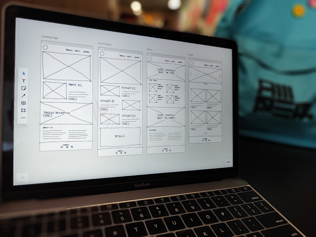
How we actually use the new features
Here’s a practical workflow that mirrors how we roll out a new landing page or refresh an existing one.
- Generate a base page with a clear prompt that includes our primary goal, target audience, and desired tone. We try to be specific: what action we want visitors to take and any mandatory assets such as logos or testimonials.
- Review the generated page on mobile and desktop. At this stage, we look for major layout issues, image relevance, and if the hero section communicates the value proposition.
- Use section-level revision to refine specific parts. Common edits include:
- Changing the hero background to dark mode while keeping the section spacing
- Rewriting a bullet list or FAQ without altering the styling of the section
- Swapping an image or replacing a placeholder with a real photo
- Tweak CTAs and tracking snippets if needed. Because the layout remains stable after revisions, these tweaks are less likely to break the design.
- Publish and monitor. We often A/B test small variations made at the section level to see what resonates.
Real-world scenarios where the changes help
Scenario: Promoting a last-minute webinar
We needed a landing page in under 24 hours. The AI-generated hero and registration form were usable immediately. We used the revision tool to darken the hero section for contrast and to tighten the copy on the registration button. The page looked professional with almost zero manual fixes.
Scenario: Refreshing an outdated pricing page
The content needed updated features and a new comparison table, but the rest of the page already matched our brand. Section-level edits let us swap the pricing block and update the FAQ without redoing testimonials or the footer. That saved a lot of design time.
Scenario: Bringing a new team member up to speed
Onboarding someone to take over landing page edits was smoother because they could reliably make small changes without breaking the page. The consistent layouts reduced the number of questions they had about spacing and alignment rules.
Best practices for getting the most value
- Start specific – give the AI a clear objective: lead magnet download, webinar signups, or product preorders. The more precise the goal, the better the initial output.
- Lock sections you love – if a section is perfect, avoid touching it during revisions to maintain consistency.
- Use the revision feature for tone and visual shifts – ask for copy tone changes or color scheme swaps at the section level rather than a full regenerate.
- Review across devices – even though layouts are more reliable now, always preview on mobile to catch any edge cases.
- Keep assets ready – have approved logos, brand colors, and hero imagery available. Replacing placeholders with real assets makes the page feel intentional faster.
Limits and things to watch for
While these upgrades solve many common pain points, there are still areas where human oversight matters.
- AI-generated copy can still be generic. We always refine headlines to match our unique voice.
- Complex interactive components might need manual adjustment for advanced behaviors.
- Brand-specific nuances like a custom font or atypical spacing may require a quick manual tweak post generation.
Overall, the changes reduce the frequency and severity of those manual fixes. They do not replace a thoughtful content strategy, but they remove friction from the execution.
How the revision log helps accountability
The revision log is another understated improvement. It records notes about what changed during each revision. For our small team, that means fewer misunderstandings and a clearer trail of edits.
- We can see why a section was modified and by whom when multiple people edit the same page.
- It helps during post-launch reviews to understand which edits corresponded with performance changes.
- We use the log to onboard teammates quickly so they understand the reasoning behind previous edits.
Practical ROI: Where the time savings show up
Time saved falls into predictable buckets:
- Less manual layout tweaking after generation.
- Fewer full-page regenerations that force redesigns of unrelated sections.
- Faster onboarding and fewer revision cycles between team members.
Those differences may not show up on a single page, but across multiple launches they add up into meaningful operational time that we can reallocate to marketing strategy and customer conversations.
Final thoughts
The upgrades give us what we want most from automated page creation: high-quality starting points and the confidence to make targeted changes without losing the layout. For businesses juggling limited time and resources, that means fewer headaches and faster launches.
We still apply our judgment to messaging and conversion tactics, but the tech now removes a lot of the low-value work. That lets us focus on the parts that matter: testing offers, refining copy, and connecting with customers.
Frequently asked questions
Can we change only the headline or will the whole page update?
You can change a single section such as the headline without regenerating the entire page. The revision control lets us request precise edits so the rest of the layout and styling stay intact.
Will images be relevant to our content or do we need to replace them?
The image choices are better and more context-aware than before, but we still replace some images to match brand visuals. The improvement reduces the number of swaps needed, though swapping remains easy when we want to use our photos.
Does the upgrade improve mobile responsiveness?
Yes. Layouts are more reliable across devices, with fewer stacking and spacing issues. We still preview on mobile to catch edge cases, but the number of fixes required has dropped significantly.
Can multiple team members edit the same page safely?
The revision log and section-level edits make collaboration smoother. Team members can target specific areas without overwriting others, and the history helps track who changed what and why.
Is this suitable for complex product pages?
The upgrades work well for many product pages, especially when the goal is a clear, conversion-focused layout. For highly interactive elements or very custom functionality, a quick manual review may still be necessary.
How do we maintain consistent branding across multiple pages?
Use the same prompt and lock sections that reflect your brand identity. When revising specific sections, the rest of the page will retain the established styling, helping keep a consistent look without extra effort.
Will this reduce the number of tools we need?
In many cases, yes. Better initial design and smarter edits can cut down on external editors and assets we previously depended on. It does not eliminate all tools, but it reduces the overall tool sprawl for page creation and revisions.